Normal view

Meta Sets Default for Instagram Accounts to Permit Content Reuse by AI

9 July 2026 at 16:10

Eli Tan, reporting for The New York Times (gift link):

The company’s new A.I. image generator has a surprising twist: It allows people to use images from public Instagram accounts.

When Meta unveiled an artificial intelligence image generator called Muse Image on Tuesday, it came with a feature that let users create A.I. images based on people’s Instagram photos. Any adult with a public Instagram account was automatically opted in. Using the Meta AI app, the company’s stand-alone chatbot, other users could pull from “part or all of your published photos” to create new A.I. images, the company wrote in a blog post.

This is an utterly unsurprising twist, given the entire history of the company. There are settings to turn this off (which Tan explains how to find), but to me it really does show that Meta views its users as something akin to vassals.

★ What’s Good for the iOS Goose Is Often Not Good for the MacOS Gander

9 July 2026 at 03:45

Tobias Steinke, replying on Mastodon to my “Apple Should Eliminate the App Icon ‘Squircle Jail’” piece:

But iOS app icons (and iPadOS) were always in squircle shape. Why is and was this okay for you, but it’s not for macOS?

This is a good and fair question. But I not only have an answer, I have an answer that clarifies why this entire debate is important. That “design is how it works” applies even to something as seemingly superficial as icons.

There are all sorts of limitations and simplifications in iOS that would be bad ideas to bring to MacOS, which would range in effect from disappointing to frustrating to maddening to ruinous. Where squircle jail falls on that scale is subjective. It’s certainly not ruinous, but I’d say it’s maddening. (iOS baby-computer-isms that would be ruinous to bring to MacOS would include killing AppKit, removing the Unix terminal layer, or requiring all apps to come from the App Store.)

MacOS has suffered many such frustrating decisions before. E.g., it arguably makes sense for iOS to omit always-visible scroll bars because screen real estate is so limited. It makes no such sense on the Mac.

As for mandatory squircle shapes for app icons in particular:

(a) I don’t think this is a good mandate for iOS either;

(b) it was always so for iOS, though, so it’s not like Apple has ever taken away rich creative icon shapes on the platform;

(c) MacOS is a far richer and more precise environment than iOS.

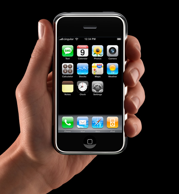
App icons on the iOS home screen are effectively simple buttons. I think it’s rather obvious that’s why they have had that squircle/roundsquare shape ever since the iPhone was announced in January 2007 (source). They’re one-tap launchers. App icons in MacOS are not mere buttons. You can drag them, move them, and drop things on them. You click them to select, and double-click to launch. They are richer objects that deserve a richer visual vocabulary. iOS is a world meant for fat-tipped Magic Markers and blunt safety scissors. MacOS is a world meant to support fine-tipped drafting pens and precision razor-sharp X-ACTO knives.

Plus, Macintosh icons have four decades of glorious history. Style and fashion change over time. But limitations should not be imposed where freedom once reigned.

And shape as a differentiating factor is not mere decoration. We have long known this. We all knew this. And not only did Apple know it, the rest of us knew it because we learned it from Apple. Via the Internet Archive, here’s Apple’s Macintosh Human Interface Guidelines from 2018,1 which was not that long ago:

Consider giving your app icon a realistic, unique shape. In macOS, app icons can have the shape of the objects they depict. A unique outline focuses attention on the object and makes it easy to recognize the icon at a glance. If necessary, you can use a circular shape to encapsulate a set of images. Avoid using the rounded rectangle shape that people associate with iOS app icons.

“A unique outline focuses attention on the object and makes it easy to recognize the icon at a glance.” Eight short years ago. That is not the description of a fad or fashion. It is a description of human perception. Our unchanging nature.

So much collective hard-earned wisdom has been ignored of late. But it’s not lost or forgotten. Chapter 11 of the 2002 Aqua Human Interface Guidelines is a good place to start remembering. There was tremendous thought, rigor, and logic behind those guidelines — all of it in the name of creating a visual language for icons that most people simply thought looked cool as fuck.


  1. It caught my attention that as recently as 2018, Apple still published platform-specific Human Interface Guidelines. At some point after that they did a Dye job on the whole thing and now there’s just one Apple Human Interface Guidelines. Instead of platform-specific HIGs, there’s one HIG, with platform-specific call-outs as sidebars within the text. This is no little thing. It’s emblematic of Apple shipping user interfaces that are ignorant of the principles Apple itself forged over the previous decades. It’s like trying to make movies without ever having watched and studied the best movies made in the past, or writing a novel without having read a fucking book. It’s not just the Mac that should have its own HIG. Each of Apple’s platforms should. (iPadOS can share iOS’s.) There could be a “foundations” HIG that serves as a primer on fundamentals, but platform-specific HIGs could — and in the past, did — explain in detail why they are discrete platforms with different idioms, capabilities, and requirements. ↩︎

‘Parry Encounters the Doctor’ — Chatbot on Chatbot Action Circa 1973

9 July 2026 at 00:38

Back in the primordial days of AI, Parry was an ELIZA-style chatbot created by psychiatrist Kenneth Colby to simulate the words of a paranoid schizophrenic. Someone had the genius idea to connect it to Eliza (a.k.a. “Doctor”). Vint Cerf published the transcript as an RFC in 1973, and I laughed my ass off reading it. A taste:

Do you know anything about bookies?

What makes you think I know anything about bookies?

A bookie didn’t pay me off once.

What does that suggest to you?

I beat up the bookie who did not pay off, and I thought he might use his friends in the underworld to get even with me.

What else would you like to discuss?

What do you know about racketeers?

Thanks to Bob Peterson for the link.

Vint Cerf, by the way, retired from Google last week at the spry age of 83.

Mac Apps Can Escape From Squircle Jail If They’re Not in the Mac App Store

8 July 2026 at 23:03

Tyler Hall:

We all know about macOS Tahoe’s terrible app icons and how 3rd party developers have been confined to squircle jail.

If you’re lucky enough to distribute an app outside the Mac App Store, you can break free of squircle jail using NSDockTilePlugIn. It’s not strictly the intended use-case of that API. And it’s not allowed in the Mac App Store, either. But it can solve the problem.

So today’s release of Iris adds three additional app icons to choose from in the app’s Special Preferences Settings pane. And since they use the NSDockTilePlugIn API, the custom icon remains even when you quit the app.

Iris is far from the only app using this or other techniques to sort-of escape squircle jail. All the apps I’m aware of doing something like this are Mac-assed apps. It’s a good litmus test.

‘Searching for SmarterChild’ Kickstarter

8 July 2026 at 22:02

After reading my posts earlier today about Eliza, the first “hit” chatbot from the 1960s, DF reader AP sent me a link to the Kickstarter page for Searching for SmarterChild, a project from documentary filmmakers Lindsey Sitz and Zan Gillies to make a movie about SmarterChild, an AOL Instant Messenger chatbot that once had 30 million “friends” (a.k.a. users). I don’t recall ever hearing of SmarterChild before, let alone using it. (I think I was on a very different level of the Internet back then.)

But this looks like a great indie nerd documentary. The Kickstarter campaign has just one week left and they’re a wee bit short of their primary goal, and quite a bit short of their stretch goals. I just chipped in.

My Conversation With Eliza

8 July 2026 at 19:33

I vaguely recall first trying some version of Eliza back in the 1990s. I never found it all that impressive nor understood its stature in the AI literature. It’s better than a bunch of if/then statements but not by much. There’s some natural language grammar parsing that is somewhat interesting, but I never thought it came close to passing the Turing Test, and I was always skeptical of claims that people got deeply involved with it as a virtual therapist/counselor. I just tried it again, via The Eliza Archeology Team’s web-based re-creation. Here’s my transcript:

HOW DO YOU DO. PLEASE TELL ME YOUR PROBLEM

I don’t really have a problem.

DON’T YOU REALLY REALLY HAVE A PROBLEM

No.

ARE YOU SAYING ‘NO’ JUST TO BE NEGATIVE

No.

YOU ARE BEING A BIT NEGATIVE

No.

WHY NOT

I’m just being honest.

IS IT BECAUSE YOU ARE JUST BEING HONEST THAT YOU CAME TO ME

No, I’m just curious to try this out.

WHY ‘NO’

I said “no” because my “just being honest” is not the reason I came to you.

YOUR JUST BEING HONEST IS NOT THE REASON YOU CAME TO I

That’s ungrammatical.

I AM NOT SURE I UNDERSTAND YOU FULLY

I am quite sure you don’t.

HOW LONG HAVE YOU BEEN QUITE SURE I DON’T

Pretty much since I got here.

There’s something wrong with people who consider today’s chatbots to be their friends or companions. But there’s something really wrong with people who considered Eliza a useful confidant. Like suffered-a-severe-head-injury wrong.

The Eliza Archaeology Project

8 July 2026 at 19:20

The Eliza Archaeology Project:

ELIZA is the original and highly influential chatbot that launched the genre of human-computer interactions using text-based agents. It was created at MIT in the 1960s as part of Project MAC by it’s [sic] designer and programmer, Joseph Weizenbaum. ELIZA not only allowed Weizenbaum to develop a mode of interaction with computers that is highly interactive, it also contributed to the way in which people were starting to conceptualize computers as having the capacity to usefully engage in conversation. You can try an accurate reimplementation of ELIZA developed as part of this project.

We plan to contextualize the program, offering its history and context as well as offering a detailed explanation of how the code works. This project will look at the culture of programming in which Weizenbaum was working and then explore his turn from ELIZA/DOCTOR, as he began to warn of the hazards of treating machines like humans. We will look at later works inspired by ELIZA and consider its influences on the way talking computer programs are represented in literature and film.

Via Jason Kottke, who also links to an upcoming book from the same team.

Their blog has an entry that discusses something I’ve been meaning to link to for a while, regarding Weizenbaum’s secretary:

Nonetheless, it is clear that Weizenbaum’s secretary actually used the ELIZA system. As he writes in Weizenbaum (1967: 477):

My secretary watched me work on this program over a long period of time. One day she asked to be permitted to talk with the system. Of course, she knew she was talking to a machine. Yet, after I watched her type in a few sentences she turned to me and said “Would you mind leaving the room, please?”

Weizenbaum writes about the effect, later actually coined the “Eliza Effect”, that this dyadic conversation could have between user and computer:

What I had not realized is that extremely short exposures to a relatively simple computer program could induce powerful delusional thinking in quite normal people. This insight led me to attach new importance to questions of the relationship between the individual and the computer, and hence to resolve to think about them.

The Eliza Effect is the propensity for humans to ascribe understanding and intelligence to computer systems. Hofstadter (1995: 167) described it as “the susceptibility of people to read far more understanding than is warranted into strings of symbols — especially words — strung together by computers”, a compelling description written in 1995 but which accurately describes generative AI systems today like ChatGPT. Similarly, Turkle described that “the Eliza effect refers to our more general tendency to treat responsive computer programs as more intelligent than they really are. Very small amounts of interactivity cause us to project our own complexity onto the undeserving object”.

Chatbot technology has changed tremendously since the 1960s. Human nature has not changed at all.

App Icon Conventions From the Original Macintosh

8 July 2026 at 16:36

Dr. Drang, in a post replete with examples of icons of popular apps from the original Macintosh, in their one-bit glory:

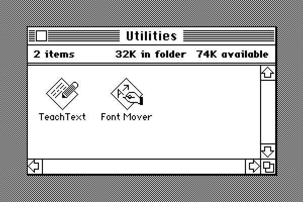
You can see that Apple liked the idea of app icons being a tilted rectangle with some image inside the rectangle to indicate what the app did. The hand was Apple’s way of telling you that this icon was for doing things, and the rectangle was tilted to match the orientation of the hand. (If you were left-handed, this was just another injustice inflicted on you by a cruel right-handed world.)

Document icons were typically upright rectangles with dog-eared corners and similar designs inside the rectangle — no hands because documents don’t do anything. But we’re not here to talk about document icons.

I never loved the hand on these icons. It felt too uniform. It functioned like a “this is an application” badge, but such a badge never felt necessary to me. But it was so ubiquitous I sort of stopped seeing it, and now, in hindsight, it holds some nostalgic warmth. Right from the start, though, TeachText didn’t have a hand — just a pencil:

Screenshot from Macintosh System 1.0 (1984), showing the icons for the TeachText and Font Mover applications in the Finder.

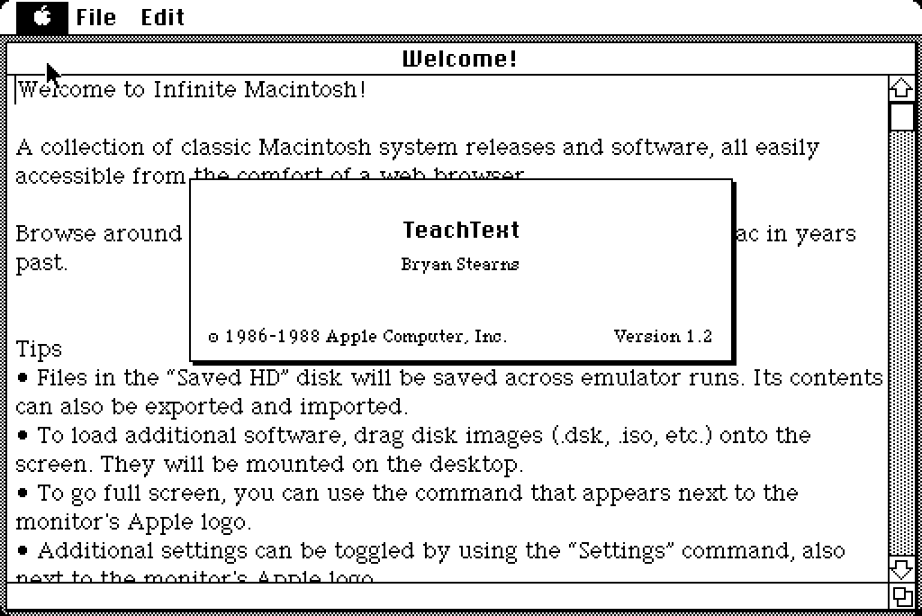
[Update: Turns out TeachText didn’t appear until 1986 and System 4.1. Before that, MacWrite was bundled with the Macintosh and served as the system text document reader. I wrongly thought that TeachText was part of System 1 because it’s on Infinite Mac’s System 1 disk image; but that image contains apps from the future that still ran with backwards compatibility on System 1. You can see the 1986 copyright in TeachText’s about box, which also gives credit by name to its author at Apple, Bryan Stearns. It may well be the case that all app icons from Apple for System 1 in 1984 had the hand-with-tool badge.]

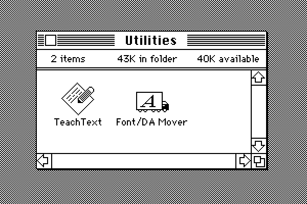
That TeachText icon was prescient about the future of good icon design. A year later the renamed and expanded (it now moved desk accessories in addition to fonts) Font/DA Mover lost the hand and became a fun truck (also prescient of great icons to come):

Screenshot from Macintosh System 2.0 (1985), showing the icons for the TeachText and (renamed and expanded) Font/DA Mover applications in the Finder.

(So many little things were still in flux in those primordial days. Note the bold text in the Finder window status bar header in System 1. That kind of looks cool, though. But the single-story “a” in the Geneva font — that’s just wrong, and gives me the ick.)

Drang continues:

Other publishers abandoned either the hands or the tilted rectangle or both. As people got more used to working with Macs, these clues for what’s an app and what isn’t became unnecessary, and icon design became less constrained. Even Apple gave up on them for utilities like Disk First Aid and Font/DA Mover.

I think it’s less that Apple gave up on them and more that it came into focus that the “hand holding a pen over a diamond-shaped document” convention was intended for document-based apps. It signified “This is a creative tool that you use to create documents”. Apps that weren’t about creating document files — like Disk First Aid and Font/DA Mover — got different icons. Font/DA Mover’s truck icon in System 2 signified that you use this tool to move things. Disk First Aid’s ambulance was an obvious metaphor for repairing something unwell. Moving and repairing are very different purposes from creating. Font Mover’s icon in System 1 wrongly suggested, if only subtly, that it was a tool for creating font-related document files of some sort.

But the main thing about the “hand holding pen over diamond” convention was that it was only ever a convention. If Apple’s squircle fetish were merely a convention, then third-party developers would be free to ignore it. Some conventions are merely fads — they come into and out of vogue quickly. Some are long-term trends that persist. But the ones that prove to be more than passing fads win out on merit in the marketplace of ideas. Mandating the squircles with squircle jail doesn’t make them a winning idea. It’s like claiming to win elections when credible rivals aren’t permitted on the ballots.

(Also, I am in complete agreement with Drang re: my favorite app icon of that era. So perfect, so fun, but so ineffable as to why it’s so perfect.)

[Sponsor] WorkOS Pipes: More Context Makes for Smarter Products

Users expect apps and agents to reach the tools they already work in. Every integration that gets you there is a different OAuth flow, a different token lifecycle, weeks of infrastructure before you write a line of product code.

WorkOS Pipes handles it with one API call. Pre-built connectors for GitHub, Slack, Salesforce, Google Drive, and more. Pipes handles OAuth, token refresh, and credential storage. You call the real provider API with a fresh token, every time.

Connect to 100+ providers →

OS 27 Developer Beta 3 Enables New ‘Pace’ and ‘Expressivity’ Sliders for Siri’s New Voices

7 July 2026 at 17:22

Sarah Perez, writing for TechCrunch:

With the latest iOS 27 developer beta, Apple is giving testers an early look at one of the upcoming improvements to its AI-powered Siri: the ability to adjust how quickly and expressively the AI assistant speaks. In iOS 27 beta 3, out today, Apple has enabled the voice controls for “Pace” and “Expressivity” that were previously labeled as “Coming soon” in the first developer beta releases.

I started running developer beta 1 on a spare iPhone the day it came at WWDC. It proved so stable, and Siri AI so useful, that I moved my primary iPhone 17 Pro to the iOS 27 betas with beta 2. So I’ve more or less been living on iOS 27 developer betas for a month now. If you’re as reckless as me, you’re probably doing so already too. If you’re not, you should probably at least wait for the public betas, the first of which I’ll bet is imminent. The stability of these betas right out of the gate is proof that this really is a Snow Leopard-type fix-and-improve-the-foundations year. I love it.

As for the new Siri voices, I think both of the new voices that are available so far are very good. Voice 1 is female and voice 2 is male; I’ve spent days with both but prefer the female voice. (I’d pay a fortune for a male voice that sounded like HAL 9000; I don’t like this guy who sounds, I don’t know, like a child psychologist or something. I don’t want “friendly”, which to me sounds saccharine and phony from a computer. The female voice sounds more emotionally removed, and thus honest, to me.)

Credit to Apple here. Now that these sliders are available, I have to say they nailed the defaults. After a month using them without the sliders, I thought that once the settings became available I might want to tone expressivity down one notch and/or turn the pace up one notch. But, no. A little less expressivity doesn’t make voice 1 sound less phony to me — it makes her sound a tad stoned. And even one click more pace sounds too fast for me — hurried, not curt. Nailing defaults is hard and I think Apple nailed these.

(The system dictionary definition of curt: “rudely brief”. That’s what I want from an AI voice. That’s a computer being honest about what it is.)

★ Apple Should Eliminate the App Icon ‘Squircle Jail’

7 July 2026 at 00:23

Paul Kafasis, in a post at Rogue Amoeba’s blog titled “Free the Icons”:

Apple’s prohibition on shapes is a step backward for both usability and creativity in app icons. Icons are now harder to distinguish because they’re no longer allowed to be distinctive. But there’s no technical reason for it. Apple could, and should, once again allow icons to take on a wide variety of shapes.

It’s clear that some people within Apple recognize that the transition to Liquid Glass introduced mistakes. They also appear to have the authority to fix those mistakes. Refinements to Apple’s own icons in Golden Gate are a welcome course correction, as is the much-celebrated Liquid Glass opacity slider. It’s time to correct the mistake of banning icon shapes as well.

Apple should stop forcing every icon into the same squircle.

The squircles, I will point out, are not in and of themselves the problem. The problem would be the same with any mandated shape, like, e.g., VisionOS’s circles.

John Siracusa:

Squircle Jail is the worst design-related thing Apple has ever done to Mac developers, and probably the worst icon-related thing it has ever done, period. Incredibly developer-hostile.

If squircled icons are actually better, then let that design win in the market. That’s how we transitioned from the classic Mac OS icon style to the more photorealistic Mac OS X icon style. Developers adopted it because they wanted to, and because users desired it.

John Siracusa has a long memory, cares deeply about Mac design, and is not prone to hyperbole (putting it mildly). I’m not sure I agree with him that this is “the worst design-related thing Apple has ever done to Mac developers”, but it’s certainly on the short list for consideration. And, like Siracusa, I can’t think of any other design crime Apple has ever foisted on Mac developers that I’d argue (with Siracusa) was worse.

It’s one thing for Apple to force all of its own app icons into the same identical shape. That would be bad enough, because Apple’s own Mac apps are numerous and popular, and as the platform owner Apple necessarily sets the direction that many third-party apps follow. But it’s just downright spiteful to enforce it platform-wide. Apple decided they’re no longer going to create nice icons with unique, interesting, and most importantly, distinctive shapes — but they no longer allow third-party apps to either. It’s like Apple decided every single one of its own apps must wear a stupid-looking hat, and they put those stupid-looking hats on third-party apps too, whether the developers of those apps want them or not. Scratch that. Not hats but helmets. The mandatory squircle makes identifying apps at a glance harder in the same way that it’s difficult to identify individual people if they’re all wearing same-shaped helmets. Real helmets at least serve an important safety purpose. The squircles are like stupid unnecessary helmets.

To that point, Jim Nielsen draws an even better analogy — traffic signs:

Consistency for traffic signs! Let’s start by redesigning them all to be the same shape.

Four diamond-shaped road signs: a yellow right-turn warning sign, a red stop sign, a white speed limit 80 sign, and an Interstate 15 highway marker.

Which was a sarcasm-dripping reply to his own previous post:

Shape isn’t everything, but it’s one tool to help provide differentiation and uniqueness in icons. But not anymore.

Four Apple app icons in black on a light gray background: the Keynote lectern logo and its squircle app icon, and the Numbers bar chart logo and its squircle app icon.

Just the mere silhouette of the old Keynote icon is more recognizable, and thus more iconic, than any icon on any platform from Apple today.

No civil engineer would ever suggest changing yield and stop signs from their iconic triangles and octagons to identical squircles. The human visual system evolved to be remarkably good and quick at identifying shapes. The primary element of an app icon is the semantic meaning of its illustration. Color and shape are secondary. With the squircle mandate, Apple has removed shape from the equation.1 The purpose of icons is right there in their name: to be iconic. Shape was often the most iconic thing about an icon. Now it’s no part at all.

It makes no more sense than removing color. But Apple did that too! One of the purported reasons for the new icon guidelines across MacOS and iOS are the tinted and clear appearance options introduced last year with Liquid Glass and the OS 26 releases. These are both terrible ideas that remove color as a distinguishing factor, reducing ostensibly distinguishable icons into indistinguishable buttons. Adam Engst skewered the Clear and Tinted icon appearance options in a recent column at TidBITS, and ran a poll to see if anyone actually used them. Spoiler: nope.

App icons used to be exuberantly fun and so beautiful that they were the subject of two splendid coffee table books. This squircle shit is no fun at all, and ugly as sin.

Let’s go back.


  1. With the new Creator Studio suite, Apple has largely (and for some apps, entirely) removed semantically meaningful illustrations from its own app icons. The only thing left to distinguish them is the color of the crude squiggle inside the squircle. ↩︎

Markdown Now Has a Uniform Type Identifer (UTI) in Apple’s Version 27 OSes

6 July 2026 at 22:38

The third developer betas of Apple’s 27 OSes dropped today, and this new page in Apple’s developer documentation drew my attention — a built-in Uniform Type Identifier for Markdown data:

The identifier for this type is net.daringfireball.markdown.

This type conforms to [utf8PlainText].

My main link here is to the Swift documentation, but it’s available in good old Objective-C too.

I had previously recommended conforming to public.plain-text but stated that the text encoding should be UTF-8. I’ve updated my own recommendation to public.utf8-plain-text to enshrine the UTF-8 encoding. (Back in 2004 UTF-8 support was far from universal. Today it is.)

Backblaze Versus Dropbox

6 July 2026 at 20:34

There’s a been a lot of (justified) concern and consternation over the last year regarding Backblaze — an online backup service whose simple pitch is that it backs up your entire computer, including the startup drive and external drives — and online file storage services like iCloud Drive, Dropbox, Google Drive, and Microsoft OneDrive. Backblaze stopped including the contents of such services in its backups. Michael Tsai (as usual) collected a long list of links regarding this.

The whole thing is complicated and confusing. The basic gist, I think, is that Backblaze has stopped trying to back up the contents from these services because sometimes the files aren’t really there on your local file system, but they sorta kinda look like they’re there. That’s what I meant in my post earlier today about Maestral regarding Apple’s modern File Provider APIs. You know how sometimes in iCloud Drive — or Dropbox or OneDrive or anything else that might use these APIs — you can see a file or folder in the Finder, but there’s a “cloud” icon next to it, and you have to click the cloud icon to actually download it? That.

With Maestral none of that comes into play. Maestral just keeps a folder on your local computer in sync with the contents of your Dropbox account. Just like the original Dropbox first-party app back in the day. So if you use Maestral, Backblaze does back up your Dropbox folder, because your Dropbox folder is just a regular folder (albeit, probably, a big one). It’s not a magic folder. Just a regular folder. And the Maestral software keeps its contents in sync. With software that uses Apple’s File Provider APIs — which effectively includes iCloud Drive — what you see as a user are magic folders, and the magic is undocumented.

Now, it turns out that Dropbox’s own first-party Mac client still has an available mode that doesn’t use the File Provider APIs. Some people who use that old-school mode report that Backblaze still backs up their Dropbox folder. Some people say it doesn’t. Like I said, it’s confusing and complicated and undocumented on all sides. I would rather not worry about it. And with Maestral, I haven’t had to worry about it. When Maestral stops working, I might have to start worrying about it.

The first item Tsai links to is this post from Rob Halliday to the venerable TidBITS-Talk forum.

Allen Pike, Back in November: ‘Why Is ChatGPT for Mac So Good?’

6 July 2026 at 19:37

Allen Pike, back in November (and corresponding Hacker News thread):

Still, I wouldn’t count out the possibility of a change in course here. While mobile is king, desktop is still where work happens. While OpenAI has acquired Sky to double down on desktop, Google has long been all-in on the browser. That leaves Anthropic as the challenger on desktop, with their latest models begging to be paired with well-crafted apps.

A few months ago Google launched a native Gemini app for the Mac. A month ago I wrote about why it’s not that great, and annoyingly presumptuous. Almost all good Mac apps are native; not all native Mac apps are good.

What keeps me using ChatGPT and keeps me away from using Claude is not that ChatGPT happens to be written using native APIs like AppKit. It’s that it looks and feels like a Mac app — you know, with a Settings window that is ... a window. And even more so, with very cool features like its ability to attach a chat to an open document in BBEdit or Notes. When ChatGPT is attached to an open document in another app, it’s not a snapshot at the moment of attachment, like what you’d get by copying and pasting the whole thing into the chat, or by dragging the current version of the file into the chat. It’s a live ongoing attachment, so as the attached document/note changes, ChatGPT sees the changes. It’s such a great feature, and I don’t think it exists on any platform but the Mac. And it couldn’t exist on iOS, which, because of its kindergarten-safety-scissors design, doesn’t allow for inter-application communication.

I worry for ChatGPT’s future, though.

While Anthropic could surprise everybody by dropping a native Mac app, I would bet against that. There’s a lot of headroom available to them just by investing in doing Electron well, mixing in bits of native code where needed, and hill-climbing from “website in shell” to “great app that happens to use web technology”.

Just as ChatGPT’s unexpected success woke OpenAI to the opportunities of being more product-centric, the breakout hit of Claude Code might warm Anthropic to the importance of investing in delightful tools. Last year they brought on Mike Krieger as CPO, who certainly seems like he could rally a team in this direction given the chance.

I don’t know what Krieger is doing there, but it sure doesn’t seem like he’s focused on creating delightful tools.

See Also: In December 2024 Allen Pike was my guest on The Talk Show, for an episode largely focused on AI.

Update: I was correct — Krieger is still at Anthropic but at the start of this year he left his role as chief product officer to head up their “Labs” team, where they’re building new product experiments. Krieger spoke about the role shift briefly during an interview last week at the “AI Engineer World’s Fair” conference.

Maestral, the Open Source Splendidly Simple Mac Dropbox Client, Has Been Retired

6 July 2026 at 19:04

Maestral developer Sam Schott, on the Maestral website:

As of June 2026, Maestral is no longer actively maintained. The current version will continue to work until certificates expire.

Schott, on Maestral’s GitHub project page:

As of 2026-07-28, this project is archived. It’s been a fun challenge to develop a syncing client, but unfortunately, I find too little time to invest in Maestral these days. I’ve also moved away from using Dropbox myself.

Maestral will still remain usable in the medium term, but will no longer be actively maintained or receive updates.

You get what you pay for, and Maestral is free of charge and open source. But man, this is a real bummer. I absolutely love Maestral. It restores Dropbox to its original vision — a folder on my Mac that syncs. Nothing at all like the bloated app that Dropbox’s first-party Mac client has grown into. And it doesn’t use any of MacOS’s modern File Provider APIs, which in my experience provide me with no benefits that I want, and saddle me with much needless complexity that I don’t. With Maestral, it’s just a quiet app that runs in the background, consumes preciously few CPU and memory resources, and just syncs a folder of your choosing to your Dropbox account. I of course chose ~/Dropbox/. It’s always been super robust for me. It’s not a hack — it syncs to Dropbox using Dropbox’s APIs.

As of today Maestral continues to work just fine. I don’t know when these certificates are expiring. And I don’t know what I’m going to do when they do. I might try moving everything from my Dropbox account to iCloud Drive. That certainly seems worth trying before I resort to going back to Dropbox’s own monstrosity of a Mac client.

In theory, because Maestral is open source, someone could fork it and keep it going. But my impression has always been that it was a one-man show from Schott, and if he’s personally no longer using Dropbox, it’s easy to see why he’s lost interest in maintaining Maestral.

So it goes.

Jason Snell Ends His Column, and 28-Year Run, at Macworld

6 July 2026 at 16:35

Jason Snell, at Macworld:

My first day on the job at Macworld, Apple was perilously close to going out of business. It was the fall of 1997, and Steve Jobs had returned to Apple and engineered the ejection of Gil Amelio as CEO, but there was no iMac yet, no visible turnaround in terms of products at all. Beyond the release of the iconic “Think Different” ad campaign, there was nothing.

Apple’s survival hung by a thread. Steve Jobs asked everyone to trust him. At Macworld Expo, he had enlisted Bill Gates–Bill Gates, of all people!–to help him instill belief in the world that Apple would find a way to survive.

The world was skeptical, to say the least. My family asked what job I thought I’d get once Apple went out of business. The magazine I had worked at for four years, MacUser, had folded, and some of us had been transferred over to our rival, Macworld, presumably to publish issues until Apple finally gave up the ghost and died. We existed to minimize the loss exposure of our respective publishing companies.

1997 was weird, folks. And that’s how my tenure at Macworld started.

Day One Journal

4 July 2026 at 23:02

My thanks to Day One Journal for once again sponsoring Daring Fireball. Day One first launched in 2011 and has been the stalwart of journaling apps on Mac and iOS ever since. Day One’s apps exhibit a commitment to technical and design excellence, and, more importantly, everything they do is deeply informed by the intense personal nature of keeping a journal. (Or journals — Day One lets you create as many separate journals as you want.) The Day One Mac app is Mac-assed and the iPhone and iPad apps are, well, iOS-assed. Fast, familiar, consistent, and intuitive.

Day One recognizes that many people struggle with journalling not because they can’t write, but because they don’t know how to begin or what a “good” journal entry about their day looks like. That’s why they built Daily Chat, a guided reflection experience that helps you talk through your day, organize your thoughts, and shape them into a journal entry.

Early testers commented: “Day One’s new Daily Chat is a true game changer for my daily journaling. The AI-powered chat makes capturing thoughts effortless and inspires creativity like never before. Writing my diary has never been this intuitive and fun!

Try it for yourself, it will change the way you think about journaling.

From the DF Archive: ‘Electron and the Decline of Native Apps’

4 July 2026 at 21:28

Yours truly, back in 2018:

I don’t share the depth of their pessimism regarding native apps, but Electron is without question a scourge. I think the Mac will prove more resilient than Windows, because the Mac is the platform that attracts people who care. But I worry.

In some ways, the worst thing that ever happened to the Mac is that it got so much more popular a decade ago. In theory, that should have been nothing but good news for the platform — more users means more attention from developers. The more Mac users there are, the more Mac apps we should see. The problem is, the users who really care about good native apps — users who know HIG violations when they see them, who care about performance, who care about Mac apps being right — were mostly already on the Mac. A lot of newer Mac users either don’t know or don’t care about what makes for a good Mac app.

This eight-year-old piece holds up well. My concern was justified, but so too was my lack of defeatist pessimism. Truly native, idiomatically correct Mac-assed Mac apps are resurgent. Electron and its brethren non-native frameworks have not receded, but they haven’t gained further ground. For every Claude (Electron) there’s a ChatGPT (AppKit). I’m seeing more new good Mac apps released today than I was in 2018, and longstanding Mac stalwarts continue to thrive. High tide seems to have passed without washing the native platform away.

Apple itself is a good example. The Mac version of Journal, first introduced in MacOS 26 Tahoe, is a profound disappointment — not just because of serious bugs but because it’s un-Mac-like in sad ways. You can’t open an entry into its own window, for example. But the brand-new Siri app in the developer betas of MacOS 27 Golden Gate is pretty Mac-like. You can double-click chats in list view to open them in their own windows, for example. (You can’t double-click chats in grid view to open them into windows, though — presumably a bug.) Siri is not a great Mac app but it does feel like a Mac app, and it’s only a 1.0 in its second developer beta. It doesn’t feel like an iOS app running in a Mac window, like Journal does.

The ironic frustration with Anthropic’s Claude app being an Electron turd is that Claude and especially Claude Code are so capable of helping to create good native Mac apps. It’s one thing for a big company or organization with cross-platform aspirations but no institutional Mac expertise, like Notion or Slack or Discord, to choose Electron to create their Mac client. It’s another when it’s a company like Anthropic, whose only product’s single most impressive ability is generating programming code, including high-quality AppKit and SwiftUI code for the Mac. To return to my hammering-screws-into-the-walls metaphor from yesterday, it’s as though the building into which Anthropic decided to hammer all the screws is a renowned screwdriver factory.

Fantastical 4.1.15 Adds Calendar Mirroring

4 July 2026 at 18:57

Flexibits:

Calendar Mirroring allows you to connect two separate calendars (like work and personal) so that events from one automatically show up on the other.

The best part? No event information is sent to Flexibits servers or saved outside of your device.

You can choose to show full event details or just block the time out as a mysterious, professional “Busy”. Your coworkers don’t need to know you’re getting a root canal, they just need to know you’re unavailable.

In Flexibits’s example scenario, the idea is that you have a personal calendar with important events that you want to mirror to your work calendar, to block the times for those events off — and you might just want them marked as “Busy” on your work calendar, rather than revealing the actual details.

I’ve been using this feature in beta for a few months and love it, even though my use case is seemingly simple. For recording episodes of Dithering, Ben Thompson and I have a shared Microsoft 365 calendar. (You can guess which of the two of us set that up by that fact.) Fantastical has long had terrific built-in support for Microsoft 365 accounts. So for me, those events have always just shown up in Fantastical. For me.

The problem is, my wife and I share an iCloud calendar, where we put events we want each other to know about. My Dithering recordings have never shown up there. Ben and I record on a pretty regular schedule, but it’s always been a minor irritation that my wife can’t see when I’m booked for Dithering. Fantastical’s new mirroring feature solves this perfectly. I set up a mirror to copy all events from my Dithering calendar to my family calendar, keeping the original event titles rather than obscuring them as “Busy”. (The titles all just say “Dithering”.)

The icing on the cake is Fantastical’s longstanding “Combine identical events” preference setting. Because I have that setting on, I don’t see duplicate “Dithering” events — one from my Dithering calendar, and another from my family calendar. I just see one event for each scheduled recording, with a striped dual-color swatch that indicates that this one event exists on both calendars. It’s just perfect.

One more thing: Also somewhat recently, Fantastical added support for Anthropic’s MCP to integrate your calendaring with Claude Desktop and every other AI agent that supports the standard. David Sparks made a short demo video that shows it off. I don’t really use Claude so this didn’t hit for me personally, but it seems cool enough that it made me at least consider, for a moment, switching from ChatGPT to Claude. Then I remembered what the Claude app is like.

❌